The Tumultuous Relationship of Design and the Internet
This is an article by the Creative Director at a friend’s company: www.fg2.com. I thought it was an interesting look back at the Internet and web design.
In 1994, I had barely heard of the Internet, and like most people didn’t consider it much in my design practice. For me, it was all about Raygun and Émigré and print, print, print.
Then an AOL CD showed up in the mail (remember those?) and I was suddenly spending way too much time chatting with strangers with weird screen names. It was novel and exciting, but not yet a consideration in what I was doing with design. I might have heard “Check us out on AOL at keyword FOOTBALL,” but I wasn’t hearing “at NFL.com” yet. I first realized this was going to affect me when I saw a simple billboard in downtown Houston for one of the big oil companies. At the bottom in tiny letters (for a billboard) was a URL. It was the first time I had seen a company marketing a website like that. I thought “those are going to be everywhere in a couple of years.”
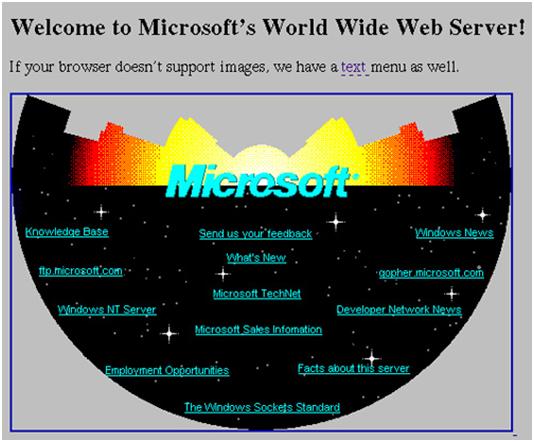
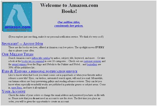
Looking at websites in 1994, you saw a lot of default grey backgrounds, Times New Roman and blue underlined links. Any images were dithered 256-color GIFs and typically ugly as hell by today’s standards, not to mention looked different depending on your operating system. Designing for the web back then consisted primarily of fighting tables and compressing graphics as much as possible while retaining some measure of legibility. Aesthetics were a luxury not yet affordable. But that would soon change.
There have been a lot of great new technologies over the last 15 years that have opened the web up to good design, but there are three that have had more influence on designers and the visual web than any of the others, and one emerging technology that will stand among them.
Bandwidth
While designers are still very aware of loading time on a site, it is nothing like it was in the beginning. It used to be that every byte was counted and loading time formulas were the rule, because everyone experienced long loading times, and browsing the web was at times painfully slow.
Thankfully, bandwidth has steadily increased and become cheaper so that our browsing experience is not only much faster, but more color-rich and visually exciting. Increased bandwidth meant increased options for designers: more and cleaner images, different fonts via graphic text, and even without those things, the freedom to not be so tied to the page load formulas. With mobile browsing finally coming around, many of the bandwidth issues have resurfaced. However, designers are armed with more knowledge and tools than they were 15 years ago. And consumers aren’t willing to accept a completely different and restricted browsing experience than what they have on their home computers, so I expect companies to continue to work hard to make mobile browsing fast, easy and familiar.
Back when 56kbps modems were the norm for an average consumer, designers used images at their client’s risk unless they were tiny. Dithered images, optimized to a web safe color palette … I shudder thinking about it. Designers felt hamstrung, especially coming from print, where color was such a huge part of the process. Personally, I found it very depressing, and I briefly left design for film for about three years until design became fun again. What made it fun again? Well …
Flash
Bringing interactivity and animation to the web was a realization of the original promise of the Internet. Adobe (née Macromedia) Flash did it first and best.
Designers loved Flash from the beginning. In a way it wasn’t the web at all. It was everything the web wasn’t to a designer: moving, attractive, interactive. It definitely challenged designers in a way they had not been challenged before in that it required a skill set outside of traditional (at the time) graphic design education. Not only did this technology change the web, it changed designers. There are designers out there that are print-focused and aren’t interested in the web for that very reason. Some would call them dinosaurs; they are at best an endangered species.
Flash hit a saturation point in the early 2000’s when it was heavily abused and got in the way of the content. The market spoke and this practice eventually waned to the point where Flash is now considered a practical and essential tool for conveying information in ways that HTML can’t. But HTML also evolved, as did additional technologies and languages that supplemented the capabilities of HTML.
CSS
CSS did something that nothing else (that I can think of) had been able to do: successfully bridge the gap between designers and developers. CSS is a programming language that designers embraced because it made designing for the web flexible. Websites were becoming more fluid and content was changing often. In HTML, that was difficult to manage because you had to see past so much formatting code to get to the content. CSS separated the formatting and left the content easily identifiable. It also made design changes across an entire website achievable by changing one line of code. This kind of flexibility made comprehensive sites with uniform design standards a possibility.
There are many newer tools that do what CSS does and more: AJAX, Ruby, Javascript, etc. But CSS was the first one that took hold, and it changed the nature of the web in ways that many didn’t expect. It all but eliminated the practice of hacking tables to get precise object placement (Hallelujah! I hated that). And as CSS has grown it is starting to take on the holy grail of web design:
Fonts
Or, more specifically, font freedom. This has been the most persistent complaint of web designers since the very beginning. Most other complaints have been addressed, but this one has been problematic. However, there is reason to hope that this will be resolved in the next couple of years. Most browsers already include some sort of font embedding feature, but they are not consistent in which technology they use, which means designers won’t use them at all outside of a completely defined environment such as an intranet.
There are multiple technologies competing to be the de facto standard of true web fonts (“true” meaning not image replacement): Typekit, EOT, WOFF, WEFT. But there are legal issues lingering, and questions of how to use DRM to protect the intellectual property of type designers. Image replacement techniques have filled the gap so far, but they are clumsy and complex, so I look forward to this getting sorted out soon in a way that’s win-win for everyone.
The Continuously Evolving Web
It’s amazing how far design on the web has come, and how it has changed graphic design as an industry, much like the web has affected so many other industries. Designers have evolved to meet the challenges that the web has presented, and as print continues to decline as a medium (I don’t think it will disappear altogether, but that’s another blog post) things will no doubt get even more interesting and exciting.
And no doubt FG SQUARED will be here for the next 15 years of innovation, geeking it up and getting down and dirty with the latest design breakthroughs, exploring new technologies and experimenting with distinctive ways to do wonderful things for our clients.
You’ve Come a Long Way, Baby
Here’s a nice little trip down memory lane.
Microsoft.com, 1994

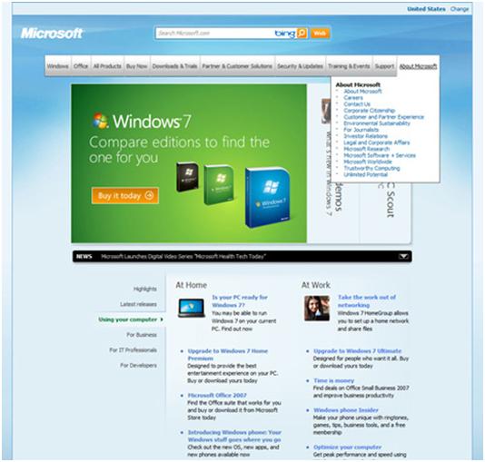
Microsoft.com, 2009

Amazon.com, 1995

Amazon.com, 2009
